Flickbae
visual design, design system, interaction design
Visual Redesign
Flickbae was a project I completed for General Assembly’s user experience design course. Looking back, I wasn’t satisfied with the hi-fi prototype designs, so I did a redesign.
Original designs below.

Movies Home Screen

Theaters Home Screen
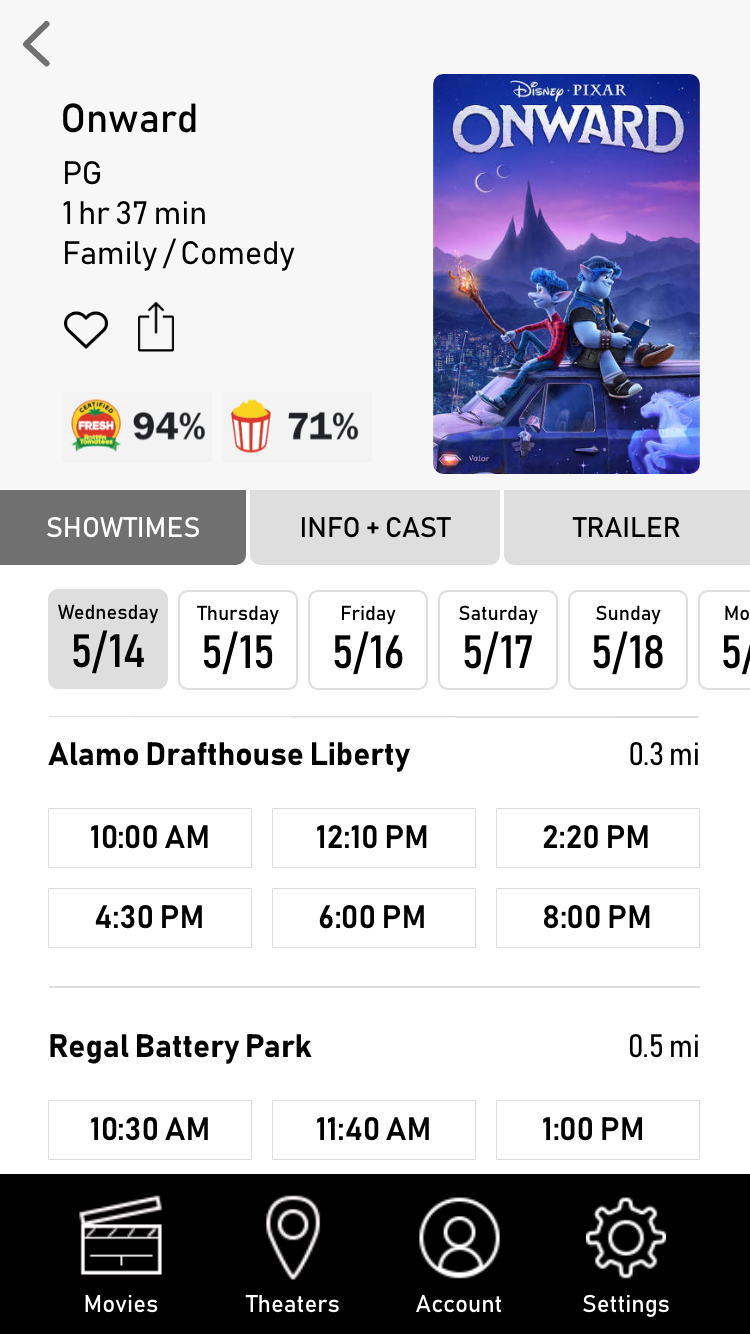
Movie Scene
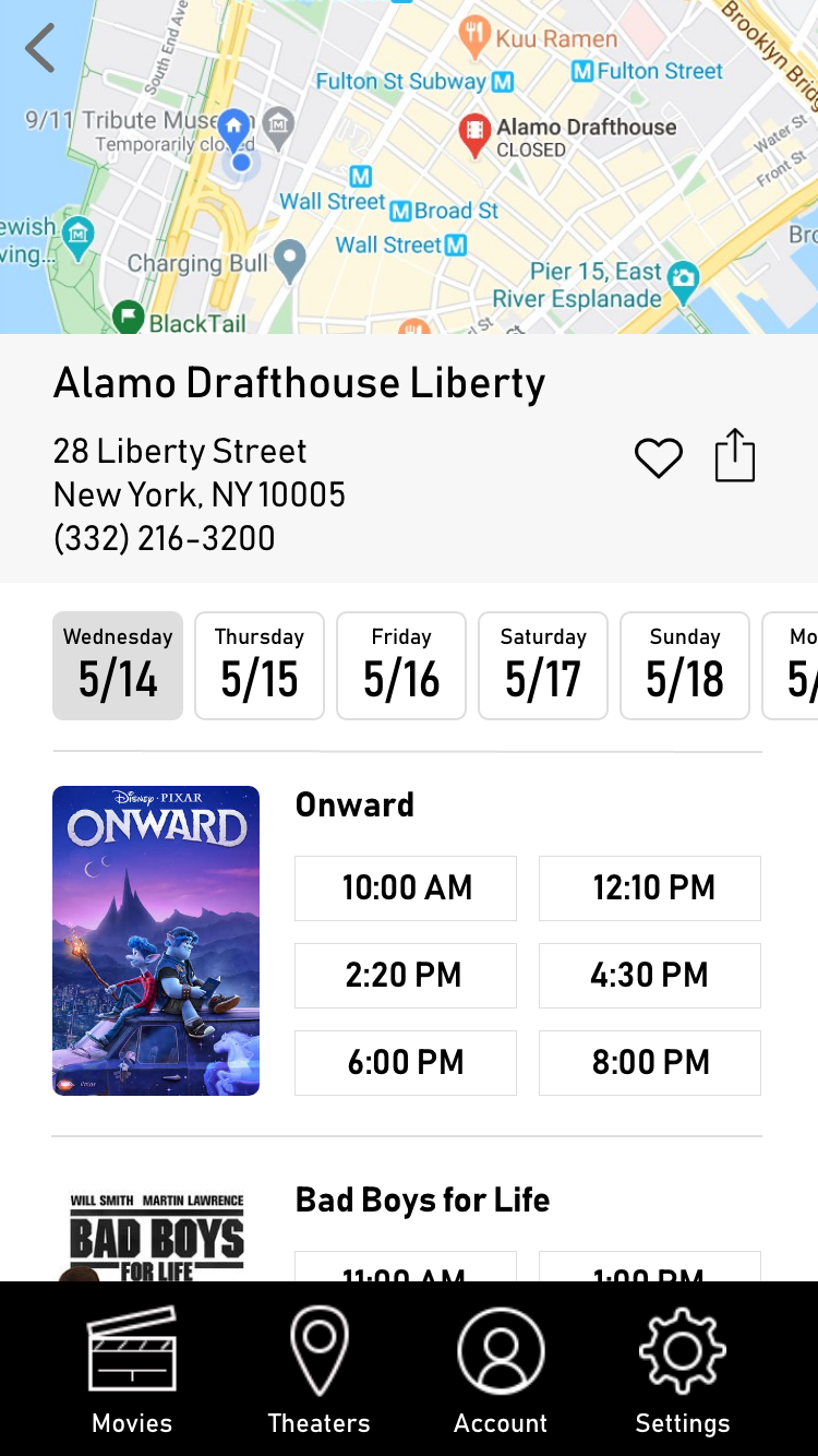
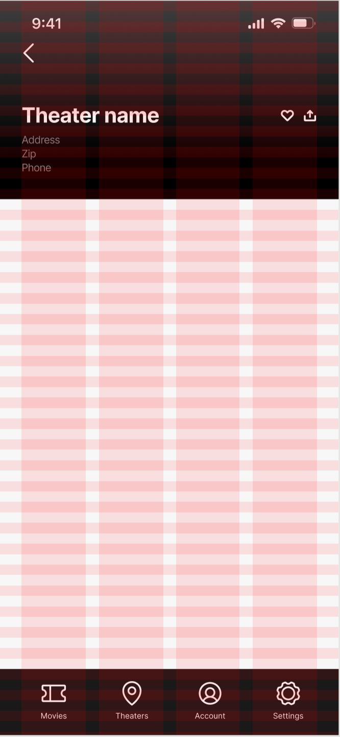
Theater Scene
What I did to improve
A few things stood out to me like lack of contrast, emphasis and balance. I researched similar brands like Fandango and AMC for inspiration.
I decided to use a completely new grid system while adhering to some of the original content designs. A few must-haves:
Use navigation headers in a different way
Change background colors and typeface for legibility
Utilize the blue color more
Consider an icon library

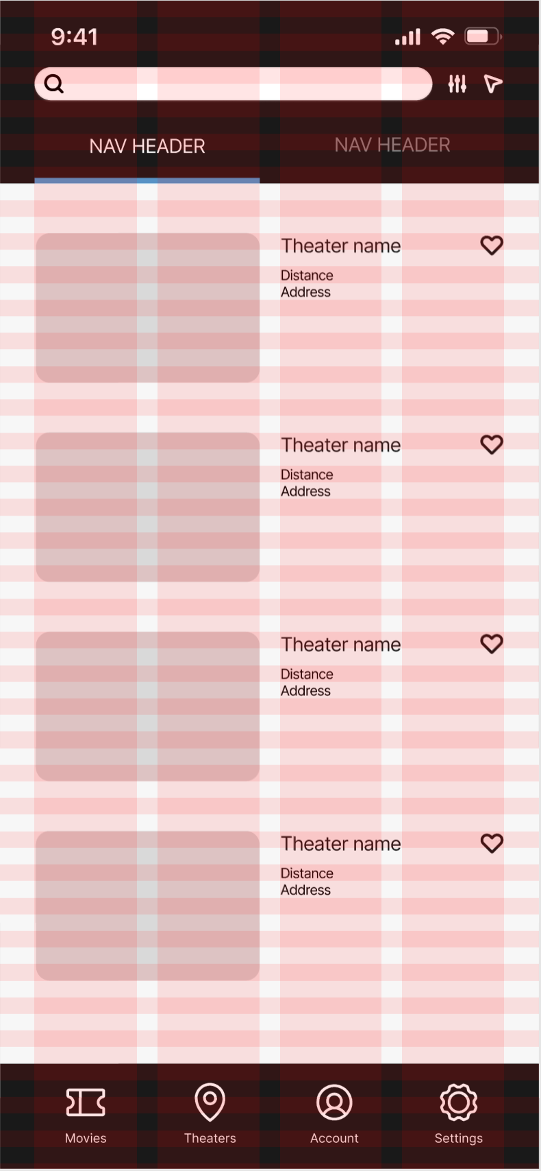
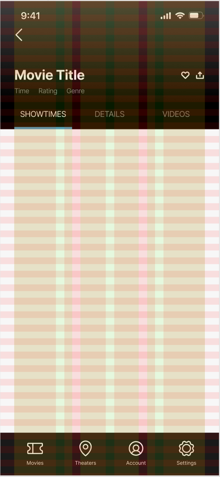
Creating a system
I also established a simple component system. I utilized color (blue and gray) for contrast, changed the primary typeface (Inter) for consistency, and reduced container sizes for balance.
Final Designs
In addition to the visual redesign, I implemented Protopie to create a more animated, interactive experience for Flickbae.
View full case study


